Pay Attention to Position

When reading Kress & VanLeeuwen’s chapter about the placement and interpretation of images, the first thing that came to mind was the recent development of the infographic. Infographics are used to break down complicated information into easily understandable parts using graphics as a natural progression of both the eye and the mind. Infographics have been made about everything from coffee to presidential elections. In both cases, they closely follow the different positioning realizations that Kress & VanLeeuwen discuss.
coffee-around-the-world_516698f11b06b

Here, the coffee infographic shows imports, exports, and prices of coffee around the world (click graphic to increase size). While this information sounds pretty dull in writing, the infographic is able to make statistics seem exciting and relevant to the audience. By placing the largest, most impressive number in the upper left, the infographic grabs attention and sparks interest. Throughout the statistics, visual representations, such as the size of the bags of coffee beans, demonstrate the numbers being given. I could easily write that “There are 9.67 million bags of coffee exported each year. Europe imports 6.5 million bags, the United States 2 million bags, Germany 1.9 million bags, Italy 771,225 bags, France 615,060 bags, and Japan 548,709 bags.” However, this information is uninteresting and has no hold on the mind. By using graphics and positioning them in this  way visually, the coffee statistics seem much more interesting.

Political_infograph_corrected

Similarly, this infographic about the 2012 election manages to present data about students in an interesting and appealing way (click graphic to increase size). Like Kress & VanLeeuwen mention, statistics are arranged from left to right, with larger numbers on the left, representing the majority of the data. The infographic also uses images that have clear associations, such as the ballot box for the number of students who intend to vote and the podium for statistics about debates. Elections in particular have become far more closely tied with the internet and social media. Because these mediums are increasingly visual, tools such as infographics become extremely important. Voters are more likely to scan the information available in an infographic than they are to read an entire article or even to watch a news broadcast.

How has the distribution of information changed so that infographics are one of the newest and most innovative means of getting ideas across? What does their popularity suggest for the future of the presentation of other information? What design skills will be more in demand now that such visually appealing displays of information are becoming the expected norm?

A picture is worth way more than 1000 words

Let’s be honest, if a picture was only worth 1000 words, Rowe wouldn’t have dedicated an entire chapter to pictures. Pictures and visual media are the primary components of how we use media. Rowe’s point, however, is that pictures mean so much more than seeing what something looks like instead of reading about it.

The primary example in the chapter is that of athletes. Rowe compares overly sexualized photographs of athletes to soft-core porn, with females being more often portrayed in this light than males. However, he also mentions the extent to which pictures are altered in the media. Pictures are used both to celebrate the accomplishments of athletes and to give ideas of their lives. Unfortunately, as Rowe points out, sex sells, thus the oversexualization of athletes (and pretty much everyone portrayed in the media). One example that comes to mind is superheroes.

Recently, I read this post on BuzzFeed that gives examples of what female superhero costumes would look like if they were designed by women. While I take issue with some of the results from a design standpoint, the point in terms of gender is clear.

enhanced-buzz-wide-20670-1379532031-9

Here, an action figure of Psylocke is shown next to her redesigned outfit. While the new attire is more modest and more practical, it is not as dynamic as the former design. Visually, the first design is more appealing, not because of the enhancement of sexual features, but because it is more striking and eye-catching.

While superheroes are fictional, they, like athletes in media, exist to be visually appealing and to encourage people to spend money. Male superheroes as well as females ones are depicted in outlandish ways to emphasize different attributes that normal humans could never have. In our society, we often elevate athletes to a level of celebrity and superhero, thus resulting in the over the top portrayals by media.

Is this a good, healthy thing? No. Should the superhero costumes with more coverage be preferable to the originals? Yes.

But, Rowe’s analysis explains how mass media portrayals have created these ideals, and then exist to sell and promote what they have created.

What kinds of images are more prevalent in media? Does this prevalence reflect the ideals explained in Rowe? How does this production influence cultural stereotypes/norms?

The Value of Visuals

When magazines were first becoming national large, national publications, Life magazine made a name for itself with the photo essay. This use of visual media in a format that had previously been reserved for primarily text-based information was not only revolutionary, but characterized Life magazine for many years following the initial release. In Chapter One of their book, Sturken and Cartwright explain many of the effects that visuals have had on the media, and the evolution of their use. They discuss everything from the infamous open casket funeral of Emmett Till to the value of modern art by Jackson Pollock, but the part that resonated the most with me was the idea that visuals give us, the audience, a stronger sense of truth behind what is being said. Photographs, especially, give a sense of events occurring in real time, establishing a connection between the viewer, the photographer, and the person pictured. While Sturken and Cartwright give a wide variety of examples, the first one that came to my mind was not included in their book.

all-is-done-1a1

This picture is of the hanging of the conspirators in Lincoln’s assassination. I was first shown this picture in high school history class. Prior to that, I did not know that such a picture existed. While it was common knowledge that cameras were available during that time, this picture had not been as widely circulated through history textbooks as others were. When I saw this picture, I was very disturbed. The image, while intended to document a historical event, seemed much more intimate than I had expected. Just as Sturken and Cartwright explained, the photograph gave a sense of immediacy to the event, as though I were there as it was happening. This picture, more than perhaps any other, remains one of the most disturbing to me. I do not know the names of the people being hung, nor do I know where they are, but the website where I found the picture has a series of pictures of the event, documenting the conspirators’ last moments. In this, it is very easy to see the power evoked by the addition of pictures to media.

What visuals strike you as the most useful? Does the use of photographs encourage you to read an article? Do photographs increase your perceived credibility of the source?

Is Blogging a form of Journalism and can you make a living from it?

From the title of this blog post, there might seem to be an obvious answer- if you can make a living from it, then blogging is journalism. However, the definition of journalism is not as concrete as one would think and, at least according to Rettberg, does not require  monetary gain from one’s efforts. That being said, Rettberg does not characterize monetary gain as a necessary element to journalism overall, but instead broadens the definition to those who provide information about topics that are relatively news-related. Given this, many bloggers are journalists of a sort, but the overall tone of the chapter gives an idea of blogging as a fluffy sort of journalism. Rettberg mentions how bloggers often regard their work as much more personal, thus making it more difficult to have objective journalism. Indeed, objective journalism is not their goal. Like the example of the Virginia Tech student who updated his LiveJournal as events on the campus progressed the day of the shooting, the original intention in many cases is not for a wide audience. This student did not intend to be a journalist, but on that day, he was one of the most sought-after sources available online.

The personal nature of blogs also relates to the possibility of monetary gain from their content. Rettberg goes into several examples of ways in which bloggers profit from their efforts, including ads, PayPerPost, and product promotions, but concludes that many bloggers see their online content as a part of themselves too personal to commercialize. Of course, there is an enormous variety of blogs and types of bloggers that cannot easily be summed up, but the economic statistics that Rettberg presents supports this idea of blogs as a non-monetary form of writing. He states that 90% of the profits in blogging are made by the top 15% of blogs. To me, this is not encouraging for the future of blogging as a money-making, “career”-type job. Instead, It is more likely that, if the economic figures continue in this way, blogs will remain personal hobbies that venture into journalism, but are not in the same category as news publications.

What is the definition of journalism? What kinds of material are you willing to pay to read? Do you think people are more or less likely to pay for online content?

How blogs developed and how they are used

In Chapter 2 of his book, Rettberg describes how the transition from the printed word to the online is comparable to the transition from both the spoken word to the written, and the written word to the printed. Several times, he references the arguments that Plato made against the written word, as he believed it to be an easier means of learning and exploring knowledge that did not require enough of either the student or the teachers. At one point, he takes issue with the written word as being “non responsive”, i.e. that you can’t ask questions of a manuscript. Thus, Plato seems to have believed, there was no way to gain additional insight or information from the source of the information, which limited the overall educational experience. While the societal and educational developments of the written and printed word were great, Plato was not wrong with his initial concern — the development of the printing press, especially, led to reading becoming a much more individual and private form of education and largely eliminated the public readings and discussions of Plato’s era.

However the standard learning process changed (or suffered) with the development of writing, Rettberg explains in chapter 3 how he believes that blogs and social media online have brought back the communicative element in writing, thus alleviating Plato’s concerns a few thousand years later. With books and other published print materials, there are often multiple separations between the author who thought of the ideas and wrote them down and the consumer who reads them. It is in only the rarest of occasions that a reader could get the opportunity to request further insight from the author. On the Internet, this is not the case. Blogs, more so than other forms of the written word, have a social and connective aspect that allows the reader to comment on the material and the author to respond in turn. Also, multiple readers of the same material can, at any given time, connect with one another and share their insights, with the author being privy to these discussions. In a way, this seems somewhat cyclic — first there was little technology but much discussion and sharing of ideas. Then, as technology gradually improved and mass communicative strategies increased, there was less discussion and more independent knowledge and learning. Now, technology has come around again to the point where discussion is easily facilitated and encourages ideas to be examined by groups around the world.

Do you read more often online or in print form? Why? What will be lost with the loss of the print form as the main format of daily reading?

Website Case Study: Huffington Post

Image What is your first impression of the site? Think of the “3 second rule.”
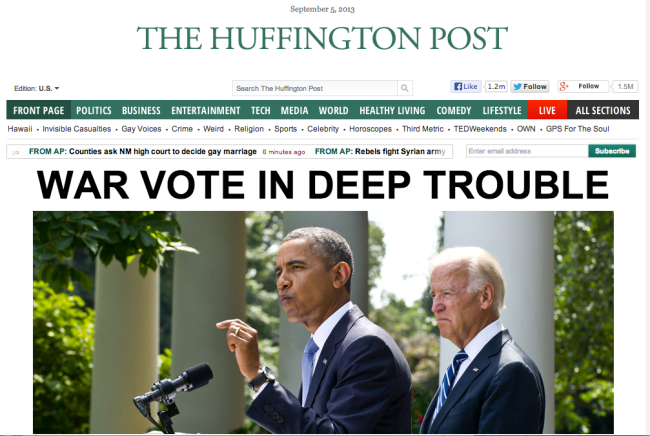
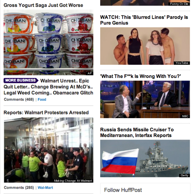
Massive headline, big photo. Attention-grabbing headline.

How does this site establish credibility? How does it establish trust? Or does it?
Genuine?
Transparency?
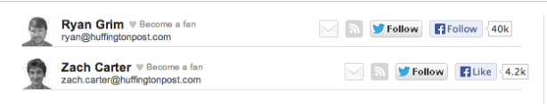
The scrolling bar at the top of the screen with minute-by-minute updates helps establish credibility, as does the information about writers of articles, including their pictures and contact information, such as twitter handles. This apparent transparency also gives the impression of stories being genuine, with the reader having a clear idea of the writer.

Image

What is the general writing style?
Biased?
Objective?
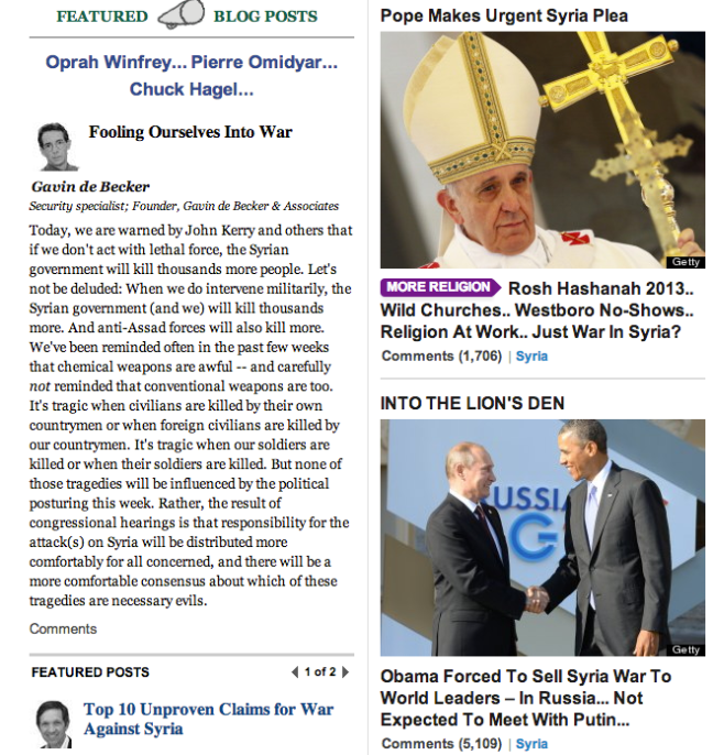
News articles tend to come across as fairly objective, but those articles characterized as blog posts are biased as to the authors’ opinion on the subject. Authors give the impression that they choose their own topics, thus incorporate their own biases.

Does the writer IDENTIFY with his or her readers, or not? How (or why not)?
The increased personal nature of the blog posts helps to identify with the readers as it can use first person and references to popular culture, but the general news only relates to the reader in the sense that the reader cares about the topic of the article.

Does the writing style get to the point?
The main news articles get to the point quickly and are very easy to understand. Blog posts, on the other hand, tend to be wordier and focus more around the individual writing style of the person posting.

How is it arranged? Is it arranged in reverse pyramid style?
Overall layout of the website is in reverse pyramid, with more important articles at the top of the page. In the articles themselves, news features tend to have the most information at the beginning, while blogs have more stylistic leads before getting to the basic information.

Image

Is content shaped for scanning? How is the content layered?
News content is shaped for scanning. A big front lead encourages scanning, with the more popular stories arranged from top to bottom. Articles tend to have shorter articles with media dispersed throughout, making scanning very easy.

Is the tone or rhythm of the site consistent throughout?
Wide range of content, thus also tone. However, the layouts and style remain constant.

How does the site use headlines?
Headlines are used to draw the reader towards certain stories. All headlines are very straightforward and tend toward action words and succinct descriptions. They seem to be very “searchable” because they are so direct.

How does it use links? Effectively or not?
There are very few links to outside websites, but the links within Huffington Post seem to be effective. Clicking on front page news stories takes the reader to the story, as well as a genre-specific page, i.e. clicking on “Pope Makes Urgent Syria Plea” goes to the article within the Huff Post Religion section.

How is multimedia used? Is it distracting? How is it displayed on the site? Does the multimedia tell the same story as the text, or a different side of the story?
On the front page, there are many pictures used to add context to the stories. On actual story pages, there may be videos accompanying the article, but they do not distract from the information in the article. Like the headlines, pictures are used to draw the audience in to different topics, and while they tend to be relevant, do not always supply information that is absolutely necessary to the story.

Image

How does the site “package” stories?
Hyperlinks within stories are used sparingly, but effectively. They primarily give additional information about the topic that would be superfluous to the article itself. Additionally, there are related stories at the end of the article that still keep the user on the Huffington Post site, but provide more information.

How are graphics used?
Too cluttered?
Are the graphics consistent through out the site, and consistent to the brand?
Do they encourage or discourage use, and how?
Graphics are consistent throughout the site, with different colors denoting different sections. Occasionally pages appear cluttered because the graphics are very close together and quite large, but overall they are fairly effective in encouraging visits to additional pages.

Image

Can each page stand on its own?
Each page does have the ability to stand on its own because all of the Huffington Post information stays at the top. No matter how you get to the page, you know it is from the Huffington Post and how to get to other articles.

How is the navigation? Do you get lost? Do you always know where you are? How (or why not)?
The standardized navigation bar at the top of the page is fairly convenient and keeps the user grounded in what section of the publication they are looking at. Color coding helps this too, with the main page being green, and others changing according to topic but maintaining formatting.

Image

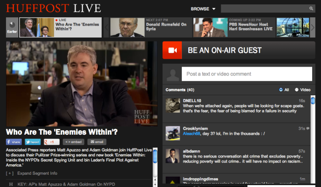
How does the site incorporate/interact with its audience? How does it embody the social aspect of the internet (or does it)?
The HuffPost Live section of the website incorporates social media, because users are encouraged to leave their feedback as videos are streamed in real-time. This section features scheduled programming, much like TV, but with a rolling feed of user comments on the side. Also, users are encouraged to leave comments at the end of each news article.

Image

Grab their attention for a good reason

In chapter four of Writing for Digital Media, Brian Carroll explains how best to create a headline that will both inform and draw in the reader. Good headlines, he says, are not just catchy, but are also tell the reader what the article is about, harking back to his previous focus on scanning. People don’t want to delve into the entire prose without having a reasonable idea of what the focus of the piece is. It’s the same idea that makes us read the inside or back cover of a book before we decide to read the whole thing. We want to make sure the effort is worth our while.

When writing a blog, you have the same duty to your audience that a publisher has to the population of the library or bookstore. You have to make the blog attractive, easy to find, and attention-getting. In my experience, this is the most difficult part of making a blog. Just finding a name for a blog that is clever, catchy, informative, and not too cheesy is ridiculously difficult. Doing that for each post? It’s no wonder that a lot of headlines fall flat. Sorry if mine are included in that number.

In chapter seven, Carroll discusses how to make a blog a legitimate a worthwhile form of journalism. You  can grab all the attention you want with the perfect headline and spot-on tags, but it’s useless if the blog itself isn’t worth reading.  A large part of making the blog worthwhile is closely tied in with credibility. Building credibility and a sense of legitimacy for your blog helps you to gain a loyal audience who believes that what you have to say is something they want to hear.

The list of Ten Steps to Better Blogging that Carroll describes are extremely helpful as well. Several that I hope to work on are Step 3- Be authentic, Step 7- Learn the Software, and Step 9- Break Up the Text. I’ve noticed that my writing style is often more formal that is appropriate for a blog platform. I tend not to relate to my audience very well, and stay stiff and aloof. Hopefully I can learn to be more authentic and write in a more conversational way. As far as software is concerned, I consider myself to be a total novice. Fortunately, WordPress is relatively easy to use, but I struggle even with that. Experimentation and work in Digital Communications should help alleviate this problem. Finally, as is probably painfully apparent, I tend towards large blocks of text. In this post, I’ve tried to break up the text into smaller paragraphs than usual, but I still haven’t been able to incorporate visual elements into my blog posts. My goal is to create dynamic, visually engaging posts that allow the reader to get the information without feeling like they had to read an essay.

What are some examples of catchy headlines? What headlines are you drawn in to read? What aspects of a website turn you away from reading it?

What matters about web design?

In chapters two and three of Brian Carroll’s book, Writing for Digital media, he discusses first how to tailor writing specifically to the web, and then begins explaining the importance of appropriate web design that works in tandem with the writing. In terms of my goals for this class, the section about writing specifically for the web was exceptionally enlightening. In many classes, I have been taught to create elegant, well-rounded prose that may not be the most direct means of communicating information, but is the most fluid and essay-appropriate writing. While this is all well and good from an educational standpoint, the Carroll explains how there is no room for this elaborate writing form online. The web is a medium of quick sound bites of information, whether audio/visual sound bites or written ones. This became even clearer when he discussed the tendency of online readers to scan web pages. I’ve noticed in my own life that I expect to be able to find information by quickly scanning online, and become irritated when it is not readily available. On the contrary, the physical act of holding a book and flipping through it forces me to become more patient. My Internet scanning skills are far less effective with works of print.

Also important in terms of scanning is the layout of the website, which Carroll also discusses at length. As well as enumerating the different ways in which to create and change elements of web design, he outlines what users expect from websites and how to best meet those expectations. The example of the Berry College Habitat for Humanity website design meeting was especially useful, as it provided a list of questions that should be asked before making any website. As Carroll explains, failure to come up with a plan for any of those questions initially could lead to many more problems with the website later. One of the main expectations from users seemed to be that the website be easily navigable. The ability to find information quickly and effectively ties in again with the previously mentioned frequency of scanning, since the average website user does not want or need to read anything other than the basics of what they are looking for. These parameters end up being a rather extensive amount of work for the website designer, but it is clear how exceptionally important they are when looking back to the quotes at the beginning of the second chapter.

“The Web is jam-packed with empty, incoherent, ill-organized, meaningless, repetitive pages. Gunk. Spam. Junk. Crap. It gives the Web a bad name.” –Rachel McAlpine, Web designer and author.

McAlpine’s statement offers a clear picture of exactly what Carroll is encouraging us to avoid. Following his own guidelines, he places this significant and attention-grabbing quotation at the beginning of the chapter, encouraging the scanner to read on and learn how to avoid giving the Web a bad name.

What are some examples of “crap” you come across frequently online? What are some websites that use their designs effectively? How must websites update to stay current in terms of web design?