As I mentioned in my previous post, I’m something of a font junkie. I love fonts and I can get lost for hours in the rabbit hole of online fonts available for download. All of that being said, I’ve learned some important things about using fonts during my explorations, but many of them are difficult to explain. While I can tell when a font doesn’t work for a certain situation or when two fonts simply don’t go together, I can’t ever seem to explain why.
Fortunately, the brilliant minds over at joustmedia.com have done just that. Below is their simple and comprehensive guide for what fonts to use and how to avoid font faux-pas. I think that this should be a standard poster in every elementary school classroom. These guidelines should become second nature to everyone in our digital age.
For the final project of this digital journey, I will be making a website. I’m planning to use Wix as the platform, as it seems user-friendly and easily customizable. However, with the creation of this website comes the question, why … Continue reading →
A major part of creating web content is appealing to the audience. To appeal to the audience, you first have to know who your audience is. Here, I’m going to examine web audience scenarios for a fashion blog that I follow, Caphillstyle.
The blog was created by Belle, who describes her blog as “a fashion blog for women who don’t want to sacrifice their sense of style for professional success.” She focuses on Capitol Hill in Washington, DC. From reading Belle’s blog, it is clear that the intended demographic of her audience is professional women around 30 (20 at the youngest, 40 at the oldest) either in Washington or on the East Coast (the intense discussion of appropriate Derby attire would never occur anywhere else). However, as Redish explains in “Writing Web Content that Works”, demographics alone cannot be used to define an audience. Scenarios are an effective alternative that give a more well-rounded idea of a target audience.
This is Amy. She is 28 years old and works as a staffer on Capitol Hill. Amy lives in an apartment in the pricey DC area, and is required to dress professionally for her job. However, her clothing is frequently limited to suits and button-downs because she lacks the knowledge and budget to change it to anything more fashion-forward. Amy is trying to get ahead in her job field as well as save money for retirement.
Amy uses the web constantly throughout the day. She is on-call 24/7 from her smartphone and gets updates from work-related sites as well as blogs that she follows for pleasure. Because Amy is budget-conscious and busy, she needs information beyond fashion that tells her not just what to wear, but how to wear it.
Admittedly, my scenario is from the wrong end- I began with the website and extrapolated an audience. However, if the website is effective (and Belle’s popularity shows it is), the scenario should be virtually the same either way.
Additionally, by tailoring the website to suit the scenario, the website is better able to brand itself for the target audience. This branding is one of the most important aspects of creating a website and allows it to be useful and memorable.
I am a difficult consumer. Actually, I’m more just a whiny consumer. A true product of my generation, I’m much more likely to whine to my friends than I am to actually return a purchase. Why? Returning things requires effort, even if the effort is just remembering to bring the thing with me the next time I go to the store. I, along with a sizable chunk of humanity, prefer things to be effortless.
The desire to make the most basic of actions even easier has long been the inspiration for entrepreneurs to create products that appeal to us at our laziest. In “The Elements of User Experience”, Jesse Garrett explains how these products are successful or unsuccessful based on the user experience. The idea of the entrepreneur is that the experience they create with their product will surpass the one already in existence.
Possibly the most well-known infomercial product in the past few years is the Snuggie.
This commercial for the Snuggie works from the basic perspective of the user experience. At the beginning, the audience is shown (somewhat comedically) the ineffective and negative user experiences of other “products”, which in this case are jackets and blankets. To sell the product, the Snuggie is portrayed as the solution to the apparent difficulties of the other items. While the user experience of either the Snuggie, a blanket, or a jacket is not very complex, it still is necessary for entrepreneurs to consider these elements.
Online, the user interface involves different elements, but the ultimate idea is the same. Users will find difficulties that exist within the interface, and developers will create means of working around these issues. As the sophistication of the developers’ creation increases, so will the difficulties present. Interfaces that are more user-friendly will out perform other interfaces, and this increase in profits will continue to drive the user-centered market online.
This is a video giving a brief look at Religious Life at Furman University. I shot all of the footage myself, and put the video together in Adobe Premiere Elements. Enjoy!
Special thanks to Tee Griscom, Deanna Heine, and Maria Swearingen for appearing in the video, and to Furman University Chaplain’s Office, Catholic Campus Ministry, and Reformed University Fellowship for graciously allowing me to film their services.
Continuing with my theme from the last post, I’m going to use another one of my favorite TV shows to illustrate the points that Douglass and Harnden make about point of view.
Bones is a show about forensic crime-solving by quirky geniuses that work in a made-up government facility called the “Jeffersonian” (not to be confused with it’s real-life counterpart, Smith). Usually, the show is shot from a very standard third person point of view, where the viewer is merely an observer to the different things going on. Often this helps to build suspense since it is, in fact, a mystery show.
However, sometimes producers like to change things up.
This video is a promo for Bones’ 150th episode. In this episode, the body of a murder victim is believed to contain a ghost (quite a departure from the show’s usual scientific outlook), and much of the footage of the episode is shot from the perspective of that ghost. As can be seen in the promo, this premise introduces some very odd shots, especially of actors directly at the camera when they are looking at the ghost. By doing this, the producers are trying to introduce the show from a first person point of view.
Usually, an episode like this would be entirely too risky for a primetime TV show. There’s danger of alienating the audience and of dropping viewers, thus endangering the future of the show. However, there has been a trend on network television of bringing the audience more into the shows on significant episodes, such as the 100th, or in this case, 150th. The West Wing, long-running political drama, did a mock-documentary for their 100th episode, where Press Secretary CJ Craig discussed her role in the White House with a camera crew and through them, the audience.
The change in point of view and difference in perspective demonstrated in these special episodes provides a valuable example of the change for the viewer that Douglass and Harnden discuss. Their analysis explains how the first person perspective can be disorienting for the viewer and how showing a character’s thoughts from a non-observatory standpoint can be somewhat of a risk for interest in the show. The fact that producers so obviously take these guidelines into account when creating their shows and save special changes for special episodes indicates just how definitively they have been proven over many years in the TV and video industry.
Lately, I’ve been watching a lot of Psych on Netflix. Is it ridiculous? Yes, but I’ve been following Dule Hill since he was on the West Wing and his improv with James Roday is incredibly entertaining.
Like most TV series, Psych has a catchy theme song accompanied by a montage of scenes from the show that come up along with the main actors’ credits. Here is the intro montage from Season 5:
Every now and then, the network will do something a bit different with the intro and change the music to fit with the theme of a specific episode. For example, one episode guest-starred Curt Smith from Tears for Fears, who did a special cover of the theme song.
When different intro music like this is used, the montage is left largely the same, but with additional footage added to fill the additional time. NBC’s copyrights don’t allow for a video of this montage to exist on youtube, but to get an idea, you can play both videos with the sound off on the first one.
In Osgood & Hinshaw’s The Aesthetics of Editing, they discuss the use of a montage as a way of establishing the material and of drawing in the audience. They also quote editor Jon Dilling, who explains how clips sometimes naturally align themselves with music without any action on the part of the editor, “For just about any cut of music, you can place pictures in a random order and eventually moments in the music will align themselves with moments in your footage.” However, Dilling goes on to say, editors cannot rely on random editing alone.
The different Psych theme songs provide an effective examination of these principles because of the change in music while maintaining the montage. The original montage is by no means perfectly aligned with the music- showing characterizations takes precedence- but there are moments where it aligns. However, these moments are also apparent in the Curt Smith cover of the theme, thus demonstrating the randomness principle that Dilling describes.
While reading Zettl’s explanations of how we perceive space in a two-dimensional space, I was immediately draw to the idea of optical illusions. As children, most of us have at one point or another been mesmerized by the whirling spirals of ink, mystery dots, and two-faced men that play on our inherent visual tendencies.
This picture, known as the Zöllner Illusion, shows diagonal lines that appear to be at different angles crossing across the page. However, the diagonal lines themselves are all at the same angle. The distortion is caused by the shorter lines that intersect with the main ones (they remind me of railroad tracks) and give the impression that the main diagonal is slanting in the direction of the shorter lines. This illusion operates under the same principle at Zettl’s example involving diagonal perspective in pictures of hills. Motion tends to follow the direction of the diagonal. Thus here, the parallels between the shorter lines give the impression that the longer lines are slanted.
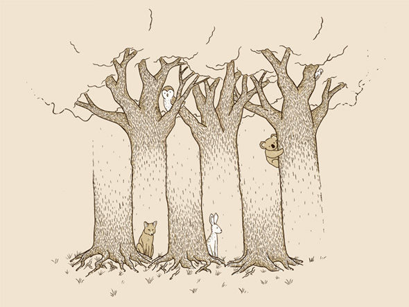
This image, known as a Blivet or Devil’s fork, has taken many different forms, varying from a simple tuning fork to an elephant with a debatable number of legs. In essence, a Blivet is something that doesn’t work, a glitch. This image is a “glitchy” image- the treetops and tree stumps do not line up. Zettl explains how we try to complete images and make them fit with our expectations by extending what already exists in the image. Here, at first glance we assume that there are three trees that are shaded at the top and bottom, but upon closer examination, there are three tree tops and three tree stumps but they do not fit together. Adding to the conundrum are the animals interspersed amidst the “trees”, taking up space that our initial perceptions tell us is filled.
Finally, to play on the idea of vectors as brought up in Zettl, I give you M.C. Escher’s “Relativity”, and the paradoxical drawing it later inspired, the Penrose Stairs.
These images go against much of what our mind expect to see, based on the concept of vectors, thus both intriguing and frustrating humanity to no end.
In the third section of Open Sky, Paul Virilio summarized many of his previous points by explaining the concept of glocalization. Admittedly, I first thought that he was off his philosophical rocker and had just misspelled and misinterpreted gloBalization, but after further reading (and some additional research to make sure I understood what he was talking about), I realized that glocalization is a different concept than globalization and one that fits with Virilio’s interpretation of how the virtual world works and interacts.
If globalization is the was that the world is becoming more homogenized, then glocalization is the way that individuality shines through the layers of sameness. Essentially, it’s niche marketing in a globalized world. Brands, products, and ideas that have rapidly spread across the world thanks to the use of technology and the internet still need to be able to identify with a localized audience. As previously mentioned in a Sturken and Cartwright reading, advertising through visual means changes with the cultural audience. In order to appeal to these different audiences, globalized corporations need to tailor their efforts to these specific cultures. Essentially, glocalization is indicative of the need for local marketing even in a global economy.
It’s especially interesting that Virilio uses the term glocalization, because his primary focus seems to be on the development of technologies toward a globalized world and how those technologies and process impact the people caught up in it. However, glocalization does factor into these efforts. While other parts of society change, the necessity of glocalization proves that people are still tied to their systems of persuasion that go deeper culturally than mere technological advances can overcome. In fact, it can be posited that glocalization is indicative of a resilience present within human culture. New technologies may be constantly changing people’s lives, but their innate cultural beliefs have been built up in a slow process over centuries and generations that will take just a long to change at its very core.
What are some example of glocalization? Does the necessity of glocalization impact the economic strategy of globalized companies? What are some of the advantages and disadvantages of glocalization? Why has the development of glocalization become necessary?