As I mentioned in my previous post, I’m something of a font junkie. I love fonts and I can get lost for hours in the rabbit hole of online fonts available for download. All of that being said, I’ve learned some important things about using fonts during my explorations, but many of them are difficult to explain. While I can tell when a font doesn’t work for a certain situation or when two fonts simply don’t go together, I can’t ever seem to explain why.
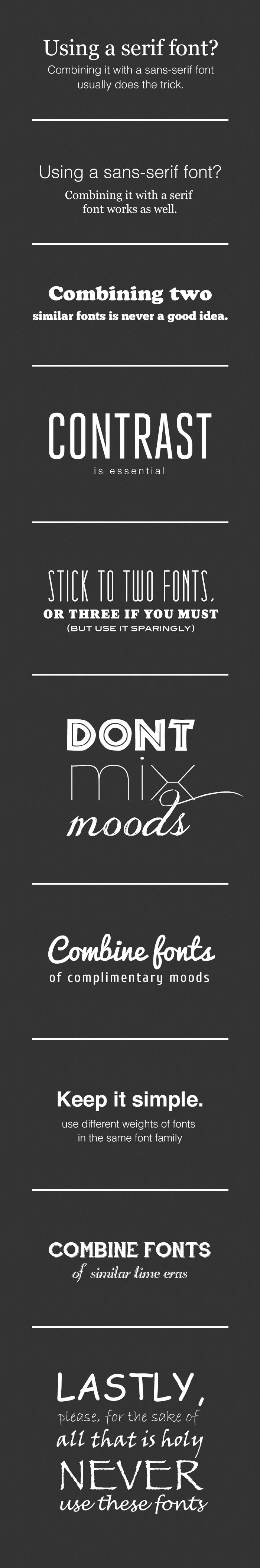
Fortunately, the brilliant minds over at joustmedia.com have done just that. Below is their simple and comprehensive guide for what fonts to use and how to avoid font faux-pas. I think that this should be a standard poster in every elementary school classroom. These guidelines should become second nature to everyone in our digital age.